Theme Extensions
Theme itself is design-agnostic — it is simply a container for a list of
ThemeExtension objects. Built-in widgets such as Button and Checkbox
depend on MaterialThemeData being registered in that list. You can attach
your own extensions to the same list to inject additional design-system data
without interfering with Material.
Import convention
ThemeExtension is available from the aggregate nuiitivet.material namespace:
Why extensions?
| Concern | Mechanism |
|---|---|
Keep Theme design-agnostic |
Theme holds no built-in color roles. All data lives in extensions. |
| Support multiple independent concerns | Each extension has a distinct type; theme.extension(T) retrieves exactly one. |
| Enforce uniqueness | Registering two extensions of the same type raises ValueError. |
Retrieving an extension
import nuiitivet.material as nv

mat = nv.Theme.of(self).extension(MaterialThemeData)  # returns MaterialThemeData | None
Always guard the result against None — extension() returns None when
the extension is not present or when the widget is not yet mounted.
Use case 1 — Custom widget backed by a ThemeExtension
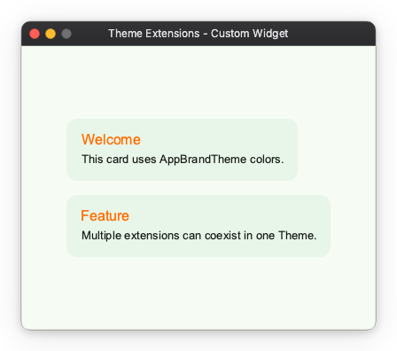
This pattern is for authors building custom widgets that need app-specific colors or sizes that do not belong to Material.
Step 1: Define the extension
from dataclasses import dataclass, replace

@dataclass(frozen=True)
class AppBrandTheme:
    brand_primary: str = "#1A6B3C"
    brand_on_primary: str = "#FFFFFF"
    brand_surface: str = "#E8F5E9"
    brand_accent: str = "#FF6F00"

    def copy_with(self, **kwargs) -> "AppBrandTheme":
        return replace(self, **kwargs)
@dataclass(frozen=True) satisfies the ThemeExtension protocol automatically —
all that is required is a copy_with method.
Step 2: Build a theme that includes both extensions
import nuiitivet.material as nv

def make_theme() -> nv.Theme:
    base = nv.ThemeFactory.light("#1A6B3C")
    return nv.Theme(
        mode=base.mode,
        extensions=[*base.extensions, AppBrandTheme()],
        name="app-brand-light",
    )
MaterialThemeData (from ThemeFactory) and AppBrandTheme coexist in the
same extensions list. Each has a unique type, so there is no conflict.
Step 3: Read the extension inside a widget
import nuiitivet.material as nv

class BrandCard(nv.ComposableWidget):
    def __init__(self, heading: str, content: str) -> None:
        super().__init__()
        self.heading = heading
        self.content = content

    def build(self) -> nv.Widget:
        brand = nv.Theme.of(self).extension(AppBrandTheme)
        bg     = brand.brand_surface if brand else "#E8F5E9"
        accent = brand.brand_accent  if brand else "#FF6F00"
        ...
Full sample
See the complete runnable example: samples/design-system/theme_extensions/custom_widget.py
Use case 2 — Light / Dark support
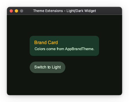
This use case extends BrandCard from Use case 1 to support runtime
light / dark switching. Two AppBrandTheme variants — one for each mode —
are swapped in by a toggle button.
Step 1: Add required fields (no defaults)
Remove the default values so each theme factory is forced to supply explicit colors for its mode:
import nuiitivet.material as nv

@dataclass(frozen=True)
class AppBrandTheme:
    brand_surface: str     # no default — must be set per mode
    brand_on_surface: str  # text color on brand_surface
    brand_accent: str

    def copy_with(self, **kwargs) -> nv.ThemeExtension:
        return replace(self, **kwargs)
Step 2: Create separate light and dark factories
import nuiitivet.material as nv

def make_light_theme() -> nv.Theme:
    base = nv.ThemeFactory.light("#1A6B3C")
    return nv.Theme(
        mode=base.mode,
        extensions=[*base.extensions, AppBrandTheme(
            brand_surface="#E8F5E9",
            brand_on_surface="#1B2A1F",
            brand_accent="#FF6F00",
        )],
        name="app-brand-light",
    )

def make_dark_theme() -> nv.Theme:
    base = nv.ThemeFactory.dark("#1A6B3C")
    return nv.Theme(
        mode=base.mode,
        extensions=[*base.extensions, AppBrandTheme(
            brand_surface="#1B3A2A",
            brand_on_surface="#C8E6C9",
            brand_accent="#FFB300",
        )],
        name="app-brand-dark",
    )
Step 3: Change nothing in the widget
BrandCard already reacts to theme changes. It reads the extension inside
build(), and that read is what makes it reactive:
import nuiitivet.material as nv

class BrandCard(nv.ComposableWidget):
    def __init__(self, heading: str, content: str) -> None:
        super().__init__()
        self.heading = heading
        self.content = content

    def build(self) -> nv.Widget:
        brand  = nv.Theme.of(self).extension(AppBrandTheme)
        bg     = brand.brand_surface     if brand else "#1B3A2A"
        fg     = brand.brand_on_surface  if brand else "#C8E6C9"
        accent = brand.brand_accent      if brand else "#FFB300"
        ...
Structurally this is the Use case 1 widget: a constructor and a build(), with
no lifecycle hooks. It reads the brand_on_surface field added in Step 1, and
its fallbacks are the dark ones because dark is this app's initial theme — that
is the whole difference. Supporting light/dark cost the widget nothing.
Theme.of(self) does two things: it resolves the theme, and it records that
the enclosing build scope depends on it. When the theme changes, the framework
rebuilds every scope that read it, so build() re-runs with the new extension
values on its own.
Full sample
See the complete runnable example: samples/design-system/theme_extensions/custom_color_token.py
Coexisting extensions
Multiple extensions of different types can live in the same Theme.
The only constraint is that each type appears at most once:
import nuiitivet.material as nv

base = nv.ThemeFactory.light("#6750A4")

theme = nv.Theme(
    mode=base.mode,
    extensions=[
        *base.extensions,   # includes MaterialThemeData
        AppBrandTheme(brand_surface="#E8F5E9", brand_on_surface="#1B2A1F", brand_accent="#FF6F00"),
    ],
    name="full-light",
)
Each widget retrieves exactly the extension it needs via theme.extension(T),
and is unaware of the others.
Summary
| Scenario | Pattern |
|---|---|
| Custom widget needs brand colors | Define a ThemeExtension, read via theme.extension(T) in build() |
| Custom widget needs light/dark adaptive colors | Define separate ThemeExtension values per mode; widget code is unchanged |
| Multiple independent design concerns | Register each as a separate extension type in the same Theme |