Layout Extras
This section introduces components for special arrangements that cannot be expressed by basic layouts like Column or Row.
Stack
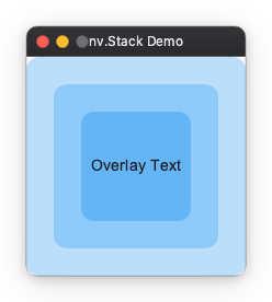
Arranges elements in stacking order (Z-order). Use this when you want to place text over a background image or display a notification badge over an icon.
- The first written element goes to the back (bottom).
- The last written element goes to the front (top).
import nuiitivet.material as nv

nv.Stack(
    width=200,
    height=200,
    alignment="center",  # Default alignment position
    children=[
        nv.Card(
            nv.Text(""),
            width=200,
            height=200,
            style=nv.CardStyle(background="#BBDEFB"),
        ),
        nv.Card(
            nv.Text(""),
            width=150,
            height=150,
            style=nv.CardStyle(background="#90CAF9"),
        ),
        nv.Card(
            nv.Text("Overlay Text"),
            width=100,
            height=100,
            alignment="center",
            style=nv.CardStyle(background="#64B5F6"),
        ),
    ],
)
Sizing a Stack child
Stack children overlap instead of sharing an axis, so every weight child is
the sole claimant on its axis: width="wt" on a Stack child means fill the
Stack, not take a share of it. There is no fraction-of-parent spec — see
Sizing.
That makes "wt" the right choice for a full-size layer (a scrim, or a
transparent aligner holding a floating button), and fixed sizes the right choice
for boxes that must nest inside each other, as above.
Deck (Conditional Display)
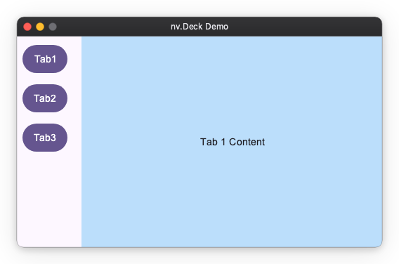
A component that displays only one child at a time from multiple children. Used for tab switching or content switching in side menus.
The index is an Observable[int], and the buttons write it. A lambda cannot
assign, so the write uses set():
import nuiitivet.material as nv

current_index = nv.Observable(0)

menu = nv.Column(
    padding=8,
    gap=8,
    children=[
        nv.Button("Tab 1", on_click=lambda: current_index.set(0), style=nv.ButtonStyle.filled()),
        nv.Button("Tab 2", on_click=lambda: current_index.set(1), style=nv.ButtonStyle.filled()),
        nv.Button("Tab 3", on_click=lambda: current_index.set(2), style=nv.ButtonStyle.filled()),
    ],
)

body = nv.Deck(
    index=current_index,
    width="wt",
    height="wt",
    children=[
        nv.Container(
            alignment="center",
            width="wt",
            height="wt",
            child=nv.Text("Tab 1 Content"),
        ).modifier(nv.background("#BBDEFB")),
        nv.Container(
            alignment="center",
            width="wt",
            height="wt",
            child=nv.Text("Tab 2 Content"),
        ).modifier(nv.background("#C8E6C9")),
        nv.Container(
            alignment="center",
            width="wt",
            height="wt",
            child=nv.Text("Tab 3 Content"),
        ).modifier(nv.background("#FFE0B2")),
    ],
)

contents = nv.Row(
    gap=12,
    width="wt",
    children=[menu, body],
)
Flow (Wrap Layout)
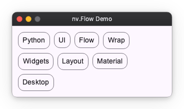
Arranges elements from left to right and automatically wraps to the next line when exceeding the parent width. Suitable for tag lists or card lists.
import nuiitivet.material as nv

tags = ["Python", "UI", "Framework", "Layout", "Grid", "Flex"]

nv.Flow(
    main_gap=8,
    cross_gap=8,
    padding=8,
    children=[
        nv.Card(nv.Text(tag), style=nv.CardStyle.outlined()) for tag in tags
    ],
)
To generate the children from a data collection (including reactive updates), see Dynamic Children.
UniformFlow (Uniform Grid)
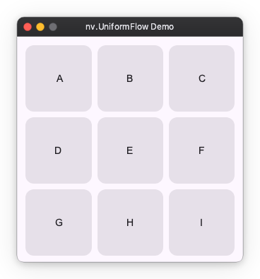
Arranges elements into a grid with uniform column widths. Use this for tile layouts where each cell should align and size consistently.
import nuiitivet.material as nv

tiles = ["A", "B", "C", "D", "E", "F", "G", "H", "I"]

nv.UniformFlow(
    columns=3,
    main_gap=8,
    cross_gap=8,
    padding=8,
    aspect_ratio=1.0,
    children=[
        nv.Card(nv.Text(t), alignment="center", padding=12)
        for t in tiles
    ],
)
Flow vs UniformFlow
- Use Flow for wrapping rows with variable-width items (tags, chips, variable text).
- Use UniformFlow for grid-like layouts with uniform columns (tiles, cards, image grids).
To generate the children from a data collection (including reactive updates), see Dynamic Children.
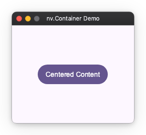
Container (Decoration/Size Control)
A wrapper with a single child element.
Used to add padding to child elements, fix sizes, or specify alignment.
(Similar to div in HTML)
import nuiitivet.material as nv

nv.Container(
    nv.Button("Centered Content", style=nv.ButtonStyle.filled()),
    width=250,
    height=200,
    alignment="center",
    padding=16,
)
Spacer (Space Adjustment)
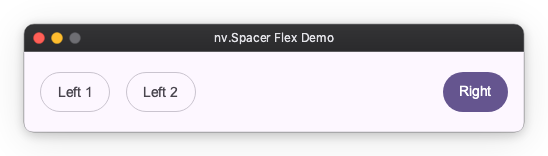
An invisible widget useful when you want to create flexible spacing.
Useful for pushing elements to both ends within Row or Column.
import nuiitivet.material as nv

nv.Row(
    padding=16,
    gap=16,
    width=500,
    children=[
        nv.Button("Left 1", style=nv.ButtonStyle.outlined()),
        nv.Button("Left 2", style=nv.ButtonStyle.outlined()),
        nv.Spacer(width="wt"),
        nv.Button("Right", style=nv.ButtonStyle.filled()),
    ],
)
Collapsible (Animated Expand/Collapse)
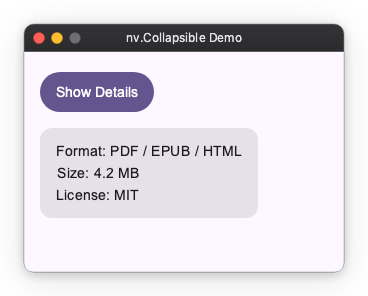
Smoothly expands or collapses a child widget, shifting the surrounding layout as it animates. Use this for expandable panels, side sheets, and accordion-style sections.
- When
openedisFalse, the child shrinks to zero size along the animated axis. - When
openedisTrue, it expands back to the child's natural size.
import nuiitivet.material as nv

nv.Collapsible(
    nv.Card(
        nv.Column(
            padding=16,
            gap=8,
            children=[
                nv.Text("Format: PDF / EPUB / HTML"),
                nv.Text("Size: 4.2 MB"),
                nv.Text("License: MIT"),
            ],
        ),
    ),
    opened=self.opened,
)
visible() vs Collapsible
visible() modifier |
Collapsible |
|
|---|---|---|
| Layout space | Always occupied | Shrinks to zero when closed |
| Animation | Opacity / scale fade | Smooth expand/collapse with layout reflow |
| Use case | Fade in/out without shifting siblings | Accordion panels, side sheets |