Other Modifiers
Other modifiers provide additional functionalities to Widgets, such as handling back navigation.
Will Pop
You can handle back navigation (e.g., pressing the Esc key) using the will_pop modifier. It takes an on_will_pop callback that returns a boolean indicating whether pop should be allowed.
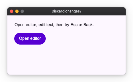
In this example, an editor screen is pushed on a Navigator. Pop is blocked while there are unsaved changes, and allowed after Save or Discard.
import nuiitivet as nv
import nuiitivet.material as md
from nuiitivet.material.buttons import Button
from nuiitivet.material.dialogs import BasicDialog
from nuiitivet.material import Overlay, Navigator
from nuiitivet.material.text_fields import TextField
from nuiitivet.modifiers import will_pop
from nuiitivet.observable import Observable
from nuiitivet.material import ButtonStyle

class HomeScreen(nv.ComposableWidget):
    def build(self):
        def _open_editor() -> None:
            Navigator.root().push(EditScreen())

        return nv.Container(
            padding=24,
            child=nv.Column(
                children=[
                    md.Text("Open editor, edit text, then try Esc or Back."),
                    Button("Open editor", on_click=_open_editor, style=ButtonStyle.filled()),
                ],
                gap=14,
                cross_alignment="start",
            ),
        )

class EditScreen(nv.ComposableWidget):
    def __init__(self) -> None:
        super().__init__()
        self.text = Observable("Hello")
        self._initial_text = str(self.text.value)

    def _is_dirty(self) -> bool:
        return str(self.text.value) != self._initial_text

    def _save(self) -> None:
        self._initial_text = str(self.text.value)

    async def _on_will_pop(self) -> bool:
        if not self._is_dirty():
            return True

        result = await Overlay.root().dialog(
            BasicDialog(
                title="Discard changes?",
                message="You have unsaved changes.",
                actions=[
                    Button("Cancel", on_click=lambda: Overlay.root().close(False), style=ButtonStyle.text()),
                    Button("Discard", on_click=lambda: Overlay.root().close(True), style=ButtonStyle.filled()),
                ],
            ),
            dismiss_on_outside_tap=False,
        )
        return bool(result.value)

    def build(self):
        return nv.Container(
            padding=24,
            child=nv.Column(
                children=[
                    md.Text("Edit text. Back/Esc asks confirmation when unsaved."),
                    TextField.two_way(
                        self.text,
                        width=420,
                        height=52,
                        padding=10,
                    ),
                    nv.Row(
                        children=[
                            Button("Back", on_click=lambda: Navigator.root().pop(), style=ButtonStyle.text()),
                            Button("Save", on_click=self._save, style=ButtonStyle.filled()),
                        ],
                        gap=10,
                    ),
                ],
                gap=14,
                cross_alignment="start",
            ),
        ).modifier(will_pop(on_will_pop=self._on_will_pop))

def main() -> None:
    md.App(
        HomeScreen(),
    ).run()
Stick
The stick modifier overlays any widget on top of a target widget at a specified anchor point. Unlike popup modifiers, the overlaid widget is always visible — it is not transient. Because it is a static overlay rather than a dynamic one, it is suited to custom decorations rather than transient indicators like notifications or status updates.
The following example composes a custom symbol by layering a smaller icon over a larger base icon. Because the result is a fixed, decorative composition — not a value that changes at runtime — it is a good fit for stick. (Avoid using it for dynamic indicators such as badges or status dots; those represent changing state and belong in transient UI instead.) Any widget can be passed as the overlay.
import nuiitivet as nv
from nuiitivet.material import Icon
from nuiitivet.material.styles.icon_style import IconStyle
from nuiitivet.modifiers import stick

def _base_icon(name: str) -> nv.Widget:
    return Icon(name, size=64, style=IconStyle(color="#5F6368"))

def _overlay_icon(name: str, color: str) -> nv.Widget:
    return Icon(name, size=30, style=IconStyle(color=color))

# cloud + upward arrow = "upload to cloud"
upload = _base_icon("cloud").modifier(
    stick(_overlay_icon("arrow_upward", "#1A73E8"), alignment="center", anchor="center")
)

# folder + star = "favorite folder"
favorite_folder = _base_icon("folder").modifier(
    stick(_overlay_icon("star", "#F9AB00"), alignment="center", anchor="center")
)

# photo + pencil = "edit photo"
edit_photo = _base_icon("photo").modifier(
    stick(_overlay_icon("edit", "#188038"), alignment="center", anchor="center")
)
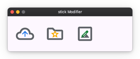
The alignment parameter sets the reference point on the target widget, and anchor sets the reference point on the overlaid widget that aligns to it. An optional offset tuple provides additional pixel adjustment.
Visible
The visible() modifier conditionally shows or hides a widget.
It is a thin composition of opacity() and ignore_pointer():
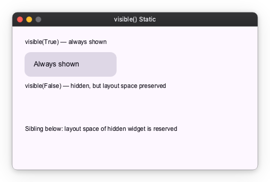
while hidden the widget is rendered fully transparent and ignores all pointer input,
but it retains its normal layout space — the surrounding layout is not affected.
Basic usage
Pass a bool or an Observable[bool] as the condition:
import nuiitivet as nv
import nuiitivet.material as md
from nuiitivet.material import Card, CardStyle
from nuiitivet.modifiers import visible
from nuiitivet.material.styles.text_style import TextStyle


def _panel(label: str) -> nv.Widget:
    return Card(
        child=md.Text(label, style=TextStyle(font_size=14)),
        padding=16,
        width=180,
        style=CardStyle.filled(),
    )


content = nv.Column(
    children=[
        md.Text("visible(True) — always shown", style=TextStyle(font_size=12)),
        _panel("Always shown").modifier(visible(True)),
        md.Text("visible(False) — hidden, but layout space preserved", style=TextStyle(font_size=12)),
        _panel("Never shown").modifier(visible(False)),
        md.Text("Sibling below: layout space of hidden widget is reserved", style=TextStyle(font_size=12)),
    ],
    gap=12,
    cross_alignment="start",
    padding=24,
)
To make visibility reactive, pass an Observable[bool]:
from nuiitivet.observable import Observable

is_visible: Observable[bool] = Observable(True)

widget.modifier(visible(is_visible))
Whenever is_visible.value changes, the widget instantly appears or disappears (no animation).
Animated usage
Pass a TransitionDefinition to animate the transition between hidden and shown states.
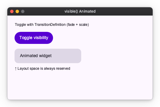
The example below combines a fade and a scale animation:
import nuiitivet as nv
import nuiitivet.material as md
from nuiitivet.animation import LinearMotion
from nuiitivet.animation.transition_definition import TransitionDefinition
from nuiitivet.animation.transition_pattern import FadePattern, ScalePattern
from nuiitivet.material import Card, CardStyle
from nuiitivet.modifiers import visible
from nuiitivet.material.styles.text_style import TextStyle
from nuiitivet.observable import Observable
from nuiitivet.widgeting.widget import ComposableWidget

_FADE_SCALE = TransitionDefinition(
    motion=LinearMotion(0.25),
    pattern=FadePattern(start_alpha=0.0, end_alpha=1.0)
    | ScalePattern(start_scale_x=0.9, start_scale_y=0.9, end_scale_x=1.0, end_scale_y=1.0),
)


class MyWidget(ComposableWidget):
    is_visible: Observable[bool] = Observable(True)

    def build(self) -> nv.Widget:
        from nuiitivet.material.buttons import Button
        from nuiitivet.material import ButtonStyle

        def toggle() -> None:
            self.is_visible.value = not self.is_visible.value

        panel = Card(
            child=md.Text("Animated widget", style=TextStyle(font_size=14)),
            padding=16,
            width=220,
            style=CardStyle.filled(),
        )

        return nv.Column(
            children=[
                Button("Toggle visibility", on_click=toggle, style=ButtonStyle.filled()),
                panel.modifier(visible(self.is_visible, transition=_FADE_SCALE)),
                md.Text("↑ Layout space is always reserved", style=TextStyle(font_size=12)),
            ],
            gap=12,
            cross_alignment="start",
        )
Note:
visible()never collapses the widget's layout size. If you need the widget to also shrink or grow in the layout during the animation, use a layout-aware widget instead.