Popup Modifiers
Popup modifiers attach transient overlay content to a widget. They are useful for menus, dropdowns, and tooltips that appear anchored to a specific widget.
All three modifiers — modeless, light_dismiss, and tooltip — share the same alignment model: an alignment point on the anchor widget is aligned to an anchor point on the overlay content, with an optional pixel offset.
modeless
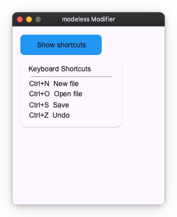
The modeless modifier opens a floating overlay anchored to the widget. The overlay sits above the widget tree and is not clipped. It does not close when the user clicks outside.
Use is_open to control when the overlay is shown. Pass an Observable[bool] and toggle it in response to user actions.
import nuiitivet as nv
import nuiitivet.material as md
from nuiitivet.material import Card, CardStyle, Text
from nuiitivet.material.divider import HorizontalDivider
from nuiitivet.modifiers import background, clickable, corner_radius, modeless
from nuiitivet.observable import Observable

is_open: Observable[bool] = Observable(False)

def toggle() -> None:
    is_open.value = not is_open.value

info_panel = Card(
    child=nv.Column(
        children=[
            Text("Keyboard Shortcuts"),
            HorizontalDivider(padding=(4, 0)),
            Text("Ctrl+N  New file"),
            Text("Ctrl+O  Open file"),
            Text("Ctrl+S  Save"),
            Text("Ctrl+Z  Undo"),
        ],
        gap=6,
        cross_alignment="start",
    ),
    padding=16,
    width=200,
    style=CardStyle.elevated(),
)

anchor = (
    nv.Container(
        width=160,
        height=40,
        child=md.Text("Show shortcuts"),
        alignment="center",
    )
    .modifier(background("#2196F3") | corner_radius(8) | clickable(on_click=toggle))
    .modifier(
        modeless(
            info_panel,
            is_open=is_open,
            alignment="bottom-left",
            anchor="top-left",
            offset=(0.0, 4.0),
        )
    )
)
light_dismiss
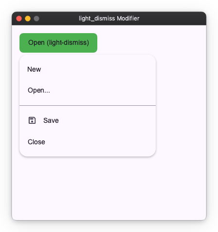
The light_dismiss modifier works the same as modeless, but the overlay closes automatically when the user clicks outside of it. This is the recommended choice for dropdown menus and context menus.
import nuiitivet as nv
import nuiitivet.material as md
from nuiitivet.material import Menu, MenuItem, MenuDivider
from nuiitivet.modifiers import background, clickable, corner_radius, light_dismiss
from nuiitivet.observable import Observable

is_open: Observable[bool] = Observable(False)

def toggle() -> None:
    is_open.value = not is_open.value

def close() -> None:
    is_open.value = False

menu = Menu(
    items=[
        MenuItem("New", on_click=lambda: print("New")),
        MenuItem("Open...", on_click=lambda: print("Open")),
        MenuDivider(),
        MenuItem("Save", leading_icon="save", on_click=lambda: print("Save")),
        MenuItem("Close", on_click=close),
    ],
    on_dismiss=close,
)

anchor = (
    nv.Container(
        width=160,
        height=40,
        child=md.Text("Open (light-dismiss)"),
        alignment="center",
    )
    .modifier(background("#4CAF50") | corner_radius(8) | clickable(on_click=toggle))
    .modifier(
        light_dismiss(
            menu,
            is_open=is_open,
            alignment="bottom-left",
            anchor="top-left",
            offset=(0.0, 4.0),
        )
    )
)
tooltip
The tooltip modifier attaches tooltip behavior to any widget. The tooltip opens automatically when the user hovers or focuses the widget (on desktop) or long-presses it (on touch), and closes automatically after dismiss_delay seconds.
Unlike modeless and light_dismiss, tooltip has no external open state. Its lifecycle is managed entirely by pointer and focus events.
import nuiitivet as nv
import nuiitivet.material as md
from nuiitivet.material import Tooltip
from nuiitivet.modifiers import tooltip

target = nv.Container(
    width=160,
    height=40,
    child=md.Text("Hover me"),
    alignment="center",
).modifier(
    tooltip(Tooltip("This is a tooltip"), delay=0.0)
)
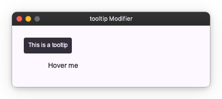
The content widget is usually a Tooltip or RichTooltip from nuiitivet.material, but any widget is accepted.
Placement
All three modifiers accept alignment, anchor, and offset parameters to control placement relative to the anchor widget.
| Parameter | Description | Default |
|---|---|---|
alignment |
Reference point on the anchor widget | See each modifier |
anchor |
Reference point on the overlay content to align with | See each modifier |
offset |
Additional (dx, dy) pixel offset |
(0.0, 0.0) |
Common placement strings: "top-left", "top-center", "top-right", "bottom-left", "bottom-center", "bottom-right", "center".