Adaptive Layout
on_size_changed Modifier
Some layouts need to change shape based on how much space they have — a toolbar that moves depending on a pane's orientation, a panel that switches arrangement once it gets narrow.
A widget cannot read its own size in build() — the parent decides that size
afterwards. So the size comes to you instead: attach on_size_changed to the
widget whose size you want to know, and the callback is called with that widget's
(width, height) whenever it changes.
Assign the size to an Observable in the callback and the widgets bound to it
update as usual. Those Observables live in a plain __init__ — nothing about
this needs a lifecycle hook.
Mind the initial value. The callback also runs once when the widget is first shown, not only when the size later changes — so whatever
Observableyou assign in it is overwritten right at startup. Give thatObservablethe value the starting size will produce. If the two differ, the UI shows the initial value for one frame and then switches.
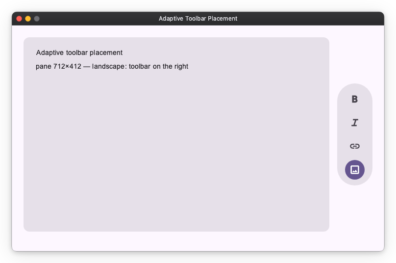
Example: Adaptive toolbar placement
A content pane places its toolbar by its own shape: a VerticalFloatingToolbar
on the right when the pane is landscape, a HorizontalFloatingToolbar on the
bottom when it is portrait.
A Grid holds all three widgets at once — card, right toolbar, bottom toolbar —
and each toolbar sits in a Collapsible that folds it away along its own axis.
The toolbar tracks are "auto", so a collapsed toolbar takes its track with it
and the card reclaims the space. The callback only has to flip one flag.
import nuiitivet.material as nv


class AdaptiveToolbarPanel(nv.ComposableWidget):
    def __init__(self) -> None:
        super().__init__(width="wt", height="wt")
        self._landscape = nv.Observable(True)      # this app's initial shape
        self._portrait = self._landscape.map(lambda landscape: not landscape)

    def _on_size(self, size: nv.Size) -> None:
        self._landscape.value = size.width >= size.height

    def build(self) -> nv.Widget:
        card = nv.Card(..., width="wt", height="wt")
        right_toolbar = nv.Collapsible(
            nv.VerticalFloatingToolbar(_actions(), style=nv.ToolbarStyle.standard()),
            opened=self._landscape, axis="horizontal",
        )
        bottom_toolbar = nv.Collapsible(
            nv.HorizontalFloatingToolbar(_actions(), style=nv.ToolbarStyle.standard()),
            opened=self._portrait, axis="vertical",
        )
        return nv.Grid(
            children=[
                nv.GridItem(card, row=0, column=0),
                nv.GridItem(right_toolbar, row=0, column=1, alignment="center"),
                nv.GridItem(bottom_toolbar, row=1, column=0, alignment="center"),
            ],
            rows=["wt", "auto"], columns=["wt", "auto"],
            row_gap=16, column_gap=16,
            width="wt", height="wt",
        ).modifier(nv.on_size_changed(self._on_size))
Keeping every widget in place, rather than swapping between two prebuilt arrangements, means there is only ever one card: reflowing reshapes it instead of replacing it, so a scroll position or a half-typed field inside it survives. The toolbars animate in and out as a bonus.
Do not change the widget's own size from its callback — assigning its
width, for example. The new size calls the callback again, which changes the size again, and so on.
When a subtree needs the size instead
on_size_changed tells a widget about its own size. Sometimes the widget that
needs the size is a different one — a control nested several levels down that has
to react to the size of a pane above it. Threading the value through every widget
in between is not practical, so Geometry publishes it to the whole subtree
instead.
| Use it when | |
|---|---|
on_size_changed |
A widget reacts to its own size. |
Geometry |
Widgets nested anywhere below need one ancestor's size. |