Popup Modifiers
Popup modifiers attach transient overlay content to a widget — menus, dropdowns, and tooltips that float above the widget tree and are not clipped by it.
Pick the one that matches how the content opens:
| Modifier | Opens when | Anchored to | Closes when |
|---|---|---|---|
popup |
your Observable[bool] turns True |
the widget's rect | you set it back to False, or an outside tap |
tooltip |
the pointer hovers or focus arrives | the widget's rect | the pointer leaves, after a delay |
context_menu |
the widget is right-clicked | the click point | an outside tap |
popup
popup opens a floating overlay anchored to the widget it modifies. You own the open state: pass an Observable[bool] as is_open and toggle it.
import nuiitivet.material as nv

is_open: nv.Observable[bool] = nv.Observable(False)

button.modifier(nv.popup(nv.Menu(items=[...]), is_open=is_open))
| Parameter | Type | Default | Description |
|---|---|---|---|
content |
Widget |
required | Widget shown in the overlay |
is_open |
Observable[bool] \| None |
None |
Open state you control |
passthrough |
bool |
False |
Whether input reaches the UI behind the popup |
dismiss_on_outside_tap |
bool \| None |
None |
Whether an outside tap closes it; follows passthrough |
anchor_passthrough |
bool |
False |
Whether a tap on the anchor passes through to it instead of counting as an outside tap |
target_anchor |
placement string | "bottom-left" |
Reference point on the anchor widget |
content_anchor |
placement string | "top-left" |
Reference point on the content |
offset |
(float, float) |
(0.0, 0.0) |
Extra (dx, dy) in pixels |
flip |
bool |
True |
May open against the anchor's opposite edge when short of room |
shift |
bool |
True |
May slide sideways to stay in view |
transition_spec |
TransitionSpec \| None |
None |
Entry/exit animation |
Blocking or floating
Two calls cover almost every case:
| Call | Result |
|---|---|
popup(x, is_open=…) |
Blocks input behind it and closes on an outside tap — the menu shape |
popup(x, is_open=…, passthrough=True) |
Lets input through and stays open on an outside tap — the toast shape |
You rarely set dismiss_on_outside_tap yourself — left at None it follows passthrough. Set it explicitly only for a blocking popup that must not close on an outside tap (passthrough=False, dismiss_on_outside_tap=False). Combining passthrough=True with dismiss_on_outside_tap=True raises ValueError: a popup that lets a tap through cannot also observe it.
anchor_passthrough is the passthrough axis scoped to the anchor's own rect. The default False treats a tap on the anchor like any other outside tap — right for a toggle anchor such as a menu button, where re-tapping it should put the popup away. Pass True when the tap means something on the anchor — a search field, where a click moves the caret: the anchor's rect is exempted from the blocking layer, so the tap reaches the anchor and the popup stays up.
Leaving is_open at None is legal, but the modifier then owns the observable and you have nothing to open the popup with. Always pass your own.
Placement
target_anchor names a point on the anchor widget, content_anchor names the point on the content that is placed onto it, and offset nudges the result. The defaults ("bottom-left" → "top-left") hang the content below the widget, left edges aligned.
Both accept "top-left", "top-center", "top-right", "center-left", "center", "center-right", "bottom-left", "bottom-center", "bottom-right".
# Centered above the widget, with a 4 px gap
nv.popup(
    panel,
    is_open=is_open,
    target_anchor="top-center",
    content_anchor="bottom-center",
    offset=(0.0, -4.0),
)
The anchor rect is re-read on every layout pass, so the content follows the widget as it moves or resizes.
Staying on screen
A popup near a window edge may not fit where you anchored it. Two behaviours handle that, both on by default:
| What it does | |
|---|---|
flip |
No room below the anchor? Open against its top edge instead — and mirror left/right the same way. The offset is mirrored with it, so a gap stays a gap. If neither side fits, the anchored side is kept and the content overflows. |
shift |
Slide the content along the cross axis to stay in view — horizontally for a popup below its anchor, vertically for one beside it. |
Neither ever moves the content along the placement axis, so a popup cannot end up covering its own anchor.
Turn flip off when the content must stay on the side you asked for, and let it overflow the window instead:
DockedDatePicker and DockedSearchBar both do this — in a short window their panels stay below the field rather than jumping above it and hiding what you are typing into.
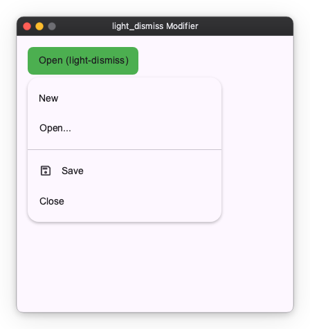
Example: menu
import nuiitivet.material as nv

is_open: nv.Observable[bool] = nv.Observable(False)

def toggle() -> None:
    is_open.value = not is_open.value

def close() -> None:
    is_open.value = False

menu = nv.Menu(
    items=[
        nv.MenuItem("New", on_click=lambda: print("New")),
        nv.MenuItem("Open...", on_click=lambda: print("Open")),
        nv.MenuDivider(),
        nv.MenuItem("Save", leading_icon="save", on_click=lambda: print("Save")),
        nv.MenuItem("Close", on_click=close),
    ],
    on_dismiss=close,
)

anchor = (
    nv.Container(
        width=160,
        height=40,
        child=nv.Text("Open menu"),
        alignment="center",
    )
    .modifier(nv.background("#4CAF50") | nv.corner_radius(8) | nv.clickable(on_click=toggle))
    .modifier(
        nv.popup(
            menu,
            is_open=is_open,
            target_anchor="bottom-left",
            content_anchor="top-left",
            offset=(0.0, 4.0),
        )
    )
)
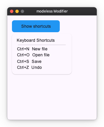
Example: pass-through panel
With passthrough=True the overlay floats above the UI without blocking it, and an outside click goes to whatever is underneath instead of closing the popup.
import nuiitivet.material as nv

is_open: nv.Observable[bool] = nv.Observable(False)

def toggle() -> None:
    is_open.value = not is_open.value

info_panel = nv.Card(
    child=nv.Column(
        children=[
            nv.Text("Keyboard Shortcuts"),
            nv.HorizontalDivider(padding=(4, 0)),
            nv.Text("Ctrl+N  New file"),
            nv.Text("Ctrl+O  Open file"),
            nv.Text("Ctrl+S  Save"),
            nv.Text("Ctrl+Z  Undo"),
        ],
        gap=6,
        cross_alignment="start",
    ),
    padding=16,
    width=200,
    style=nv.CardStyle.elevated(),
)

anchor = (
    nv.Container(
        width=160,
        height=40,
        child=nv.Text("Show shortcuts"),
        alignment="center",
    )
    .modifier(nv.background("#2196F3") | nv.corner_radius(8) | nv.clickable(on_click=toggle))
    .modifier(
        nv.popup(
            info_panel,
            is_open=is_open,
            passthrough=True,
            target_anchor="bottom-left",
            content_anchor="top-left",
            offset=(0.0, 4.0),
        )
    )
)
tooltip
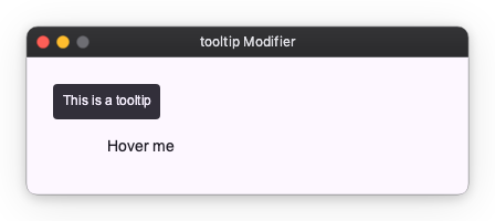
The tooltip modifier attaches tooltip behavior to any widget. The tooltip opens when the user hovers or focuses the widget (on desktop) or long-presses it (on touch), and closes automatically dismiss_delay seconds after they leave.
Unlike popup, tooltip has no open state to wire up — its lifecycle is driven entirely by pointer and focus events. It always floats, so it never blocks the UI underneath.
import nuiitivet.material as nv

target = nv.Container(
    width=160,
    height=40,
    child=nv.Text("Hover me"),
    alignment="center",
).modifier(
    nv.tooltip(nv.Tooltip("This is a tooltip"), delay=0.0)
)
The content widget is usually a Tooltip or RichTooltip from nuiitivet.material, but any widget is accepted.
delay (default 0.5) is how long the pointer must rest before it opens, dismiss_delay (default 1.5) how long it lingers after leaving. Placement works exactly as in popup, with defaults that centre the tooltip above the widget (target_anchor="top-center", content_anchor="bottom-center", offset=(0.0, -4.0)).
context_menu
The context_menu modifier opens a menu at the pointer when the widget is right-clicked (secondary button). It closes on an outside tap.
Where popup anchors to the widget's rect and is driven by an external is_open, a context menu is driven by the click itself. The modifier owns both the open state and the transient click coordinate, so neither appears in your code — there is no Observable to wire up and no pointer handler to write.
import nuiitivet.material as nv

tile = nv.Container(
    width=160,
    height=110,
    child=nv.Text("Photo"),
    alignment="center",
).modifier(
    nv.background("#90CAF9")
    | nv.corner_radius(12)
    | nv.context_menu(
        nv.Menu(
            items=[
                nv.MenuItem("Open", leading_icon="open_in_new"),
                nv.MenuItem("Rename", leading_icon="edit"),
                nv.MenuDivider(),
                nv.MenuItem("Delete", leading_icon="delete"),
            ],
        )
    )
)
There is no target_anchor here — a point has no extent, so content_anchor alone decides which corner of the menu lands on the click point (default "top-left", so the menu hangs down-right of the cursor). A right-click near the right or bottom edge pulls the menu back into view instead of clipping it.
A second right-click elsewhere dismisses the open menu rather than moving it, because outside-tap dismissal fires for any button.
For an imperative variant — placing arbitrary content at a click point without a menu — use OverlayPosition.at_pointer() directly.