Layout Overflow
If the content is larger than the parent component's size, it is drawn overflowing the frame by default. This page explains the default behavior and how to "hide" or "make scrollable" as needed.
Default Behavior (Overflow)
If the child (200x200) is larger than the parent size (150x150), it is drawn beyond the parent's frame by default.
import nuiitivet as nv
import nuiitivet.material as md

# Parent frame (150x150)
md.Card(
    width=150,
    height=150,
    padding=10,
    # Child is larger (200x200) -> Displayed as overflowing
    child=md.Card(
        width=200,
        height=200,
        child=md.Text("Overflow Content"),
    ),,
    style=md.CardStyle.outlined(),
)
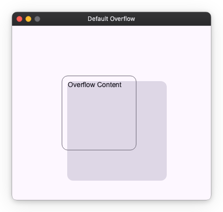
This "do not cut automatically" behavior allows decorations like shadows and badges to be displayed naturally.
Hiding Overflow (Clip)
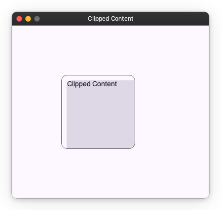
If you want to cut off (hide) the part sticking out of the frame, apply .modifier(clip()) to the parent.
import nuiitivet as nv
import nuiitivet.material as md
import nuiitivet.modifiers as mod

md.Card(
    width=150,
    height=150,
    padding=10,
    child=md.Card(
        width=200,
        height=200,
        child=md.Text("Clipped Content"),
    ),,
    style=md.CardStyle.outlined(),
).modifier(mod.clip())  # Parts sticking out of the frame are not drawn
Making Scrollable (VerticalScrollable / HorizontalScrollable)
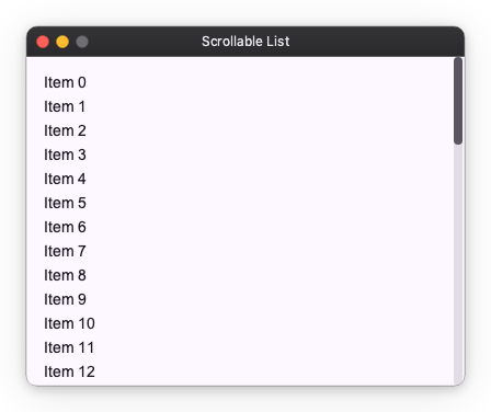
To view the overflowing part by scrolling, wrap Column or Row with an
axis-specific scrollable: VerticalScrollable or HorizontalScrollable.
import nuiitivet as nv
import nuiitivet.material as md

# Even with many items, you can scroll within the specified height (300px)
nv.Container(
    height=300,
    child=nv.VerticalScrollable(
        child=nv.Column(
            children=[md.Text(f"Item {i}") for i in range(50)],
            gap=8,
            padding=16,
        ),
    ),
)
The scroll axis is chosen by the class (VerticalScrollable /
HorizontalScrollable) — there is no direction argument.
| Argument | Description |
|---|---|
scrollbar_visible |
Whether to display the scrollbar (bool or Observable[bool]) |
style |
Scrollbar appearance via ScrollbarStyle(thickness, min_thumb_length, inset) |
behavior |
Scrollbar interaction via ScrollbarBehavior(auto_hide, …) |
controller |
A ScrollController carrying scroll physics and scroll_multiplier |
The scrollbar is a generic widget, so its colors are not baked into the
widget. Following the framework-wide ThemeData / Style split:
- The app-wide default palette comes from the active theme's
ScrollbarThemeData(track,thumb,thumb_hover,thumb_active), resolved at paint time. Each design system supplies its own — Material maps them ontoColorRole.ON_SURFACE/PRIMARY— so a single scrollbar automatically follows light/dark theme switches. - A per-instance override can be set via the matching nullable
ColorSpecfields onScrollbarStyle; aNonefield falls back to the theme.
Next Steps
- Basic Spacing: layout_spacing.md
- Other Components: layout_extras.md