Material Theme
MaterialThemeFactory is a factory that creates Theme objects pre-configured with Material Design 3 color roles derived from a seed color.
Import convention
App and ThemeFactory are the public names exported from nuiitivet.material for these classes.
Import and use them by these names throughout your code.
from nuiitivet.material import App          # MaterialApp
from nuiitivet.material import ThemeFactory  # MaterialThemeFactory
The rest of this guide follows this convention.
Setting the Theme
Pass a Theme to App via the theme parameter to apply it to the entire application.
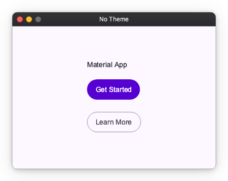
No theme
When theme is omitted, App applies the default M3 light theme (#6750A4).
Seed color
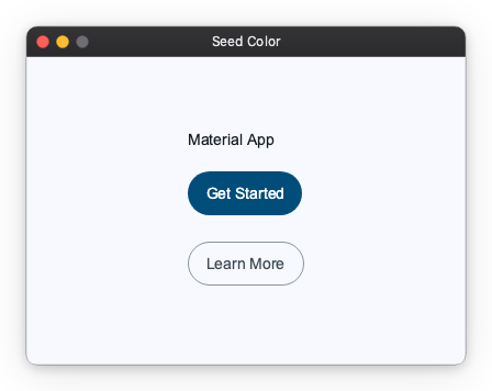
Pass a different seed color to generate a distinct M3 palette:
from nuiitivet.material import App, ThemeFactory

App(HomeScreen(), theme=ThemeFactory.light("#00639B")).run()
Dark mode
Switching Themes at Runtime
To switch the active theme, dispatch an intent via App.of(self).dispatch(intent).
Light / Dark Toggle
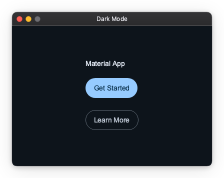
from_seed_pair generates both a light and a dark Theme from a single seed color. Use an Observable[str] for the button label so it updates reactively without a full rebuild:
from nuiitivet.material import App, Button, ThemeFactory
from nuiitivet.observable import Observable
from nuiitivet.theme.intents import ThemeModeIntent
from nuiitivet.widgeting.widget import ComposableWidget, Widget

light, dark = ThemeFactory.from_seed_pair("#6750A4")

class HomeScreen(ComposableWidget):
    _is_dark = False

    def on_toggle() -> None:
        next_theme = light if self._is_dark else dark
        App.of(self).dispatch(ThemeModeIntent(theme=next_theme))

App(HomeScreen(), theme=light).run()
See the full runnable demo: samples/material_theme/light_dark_toggle.py
Multiple Themes
When themes are too many to hold in local scope everywhere, register them by name with ThemeRegistryIntent and switch by string key:
from nuiitivet.material import App, ThemeFactory
from nuiitivet.theme.intents import ThemeRegistryIntent, ThemeModeIntent

ocean_light, ocean_dark   = ThemeFactory.from_seed_pair("#00639B")
forest_light, forest_dark = ThemeFactory.from_seed_pair("#386A20")

app = App(HomeScreen(), theme=ocean_light)

# Register before run() — app.dispatch() is safe before the event loop starts
app.dispatch(ThemeRegistryIntent(themes={
    "ocean-light":  ocean_light,
    "ocean-dark":   ocean_dark,
    "forest-light": forest_light,
    "forest-dark":  forest_dark,
}))

app.run()


# Switch from anywhere in the widget tree
App.of(self).dispatch(ThemeModeIntent(theme="forest-dark"))
See the full runnable demo: samples/material_theme/multiple_themes.py
Registry keys and from_seed_pair names
from_seed_pair accepts an optional name argument, but it assigns the same label to both the light and dark Theme — no -light / -dark suffix is appended automatically. The dictionary keys in ThemeRegistryIntent are the actual lookup keys; choose them freely.
\"light\" and \"dark\" as built-in fallbacks
ThemeModeIntent(theme="light") and ThemeModeIntent(theme="dark") are reserved shortcuts. When no theme with that exact name is registered, they fall back to a plain (non-Material) default theme.
These strings happen to equal the values of Theme.mode, but they are separate concepts — one is a registry lookup key, the other is a property of the Theme object itself.
Advanced: Color Roles in Custom Widgets
Target audience
This section is for authors building custom widgets. Built-in Material widgets apply color roles automatically; if you are only composing them, you do not need this.
Reading the current theme
Inside any mounted widget, Theme.of(self) returns the active Theme:
Applying a color role
Call theme.extension(MaterialThemeData) to retrieve M3-specific data, then look up a ColorRole:
from nuiitivet.theme.theme import Theme
from nuiitivet.material.theme.theme_data import MaterialThemeData
from nuiitivet.material.theme.color_role import ColorRole

mat = Theme.of(self).extension(MaterialThemeData)
if mat is not None:
    surface_color = mat.roles.get(ColorRole.SURFACE_CONTAINER)
ColorRole also provides a resolve shorthand that combines both steps:
Both extension() and resolve() return None outside an initialized widget tree (e.g. during construction), so always guard against None.
Example: theme-aware custom widget
from nuiitivet.widgeting.widget import ComposableWidget, Widget
from nuiitivet.layout.container import Container
from nuiitivet.theme.theme import Theme
from nuiitivet.material.theme.color_role import ColorRole


class ThemedCard(ComposableWidget):
    def __init__(self, child: Widget) -> None:
        super().__init__()
        self.child = child

    def build(self) -> Widget:
        bg = ColorRole.SURFACE_CONTAINER.resolve(Theme.of(self)) or "#FFFFFF"
        return Container(color=bg, padding=16, child=self.child)
Available Color Roles
| Group | Roles |
|---|---|
| Primary | PRIMARY, ON_PRIMARY, PRIMARY_CONTAINER, ON_PRIMARY_CONTAINER, INVERSE_PRIMARY |
| Secondary | SECONDARY, ON_SECONDARY, SECONDARY_CONTAINER, ON_SECONDARY_CONTAINER |
| Tertiary | TERTIARY, ON_TERTIARY, TERTIARY_CONTAINER, ON_TERTIARY_CONTAINER |
| Background | BACKGROUND, ON_BACKGROUND |
| Surface | SURFACE, ON_SURFACE, INVERSE_SURFACE, INVERSE_ON_SURFACE, SURFACE_VARIANT, ON_SURFACE_VARIANT |
| Surface containers | SURFACE_CONTAINER_LOWEST, SURFACE_CONTAINER_LOW, SURFACE_CONTAINER, SURFACE_CONTAINER_HIGH, SURFACE_CONTAINER_HIGHEST |
| Outline | OUTLINE, OUTLINE_VARIANT |
| Utility | SHADOW, SCRIM |
| Error | ERROR, ON_ERROR, ERROR_CONTAINER, ON_ERROR_CONTAINER |