Material Widgets
nuiitivet.material implements Material Design 3 widgets, with more on the way. This page showcases the available widgets — each with a screenshot and a link to the API reference. Overlay-based widgets (Dialog, BottomSheet, SideSheet, Loading) are covered in Material Overlay.
Import convention
All widgets shown below are exported from nuiitivet.material:
Text
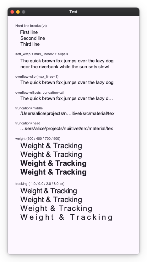
Typography component for rendering text with theme-aware styles.
Icon
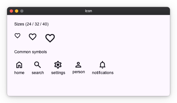
Material Symbols icon component. Specify a symbol name and an optional size.
Button
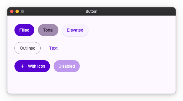
Five M3 button styles — Filled, Tonal, Elevated, Outlined, and Text — plus icon support and disabled state.
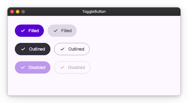
ToggleButton
Two-state button with selected / unselected appearance. Available in Filled and Outlined styles.
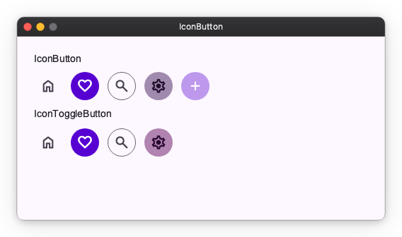
IconButton
Compact icon-only buttons in the standard M3 styles, plus a toggle variant.
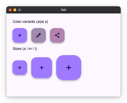
Fab (Floating Action Button)
Prominent action button. Multiple color variants and three sizes (small / medium / large).
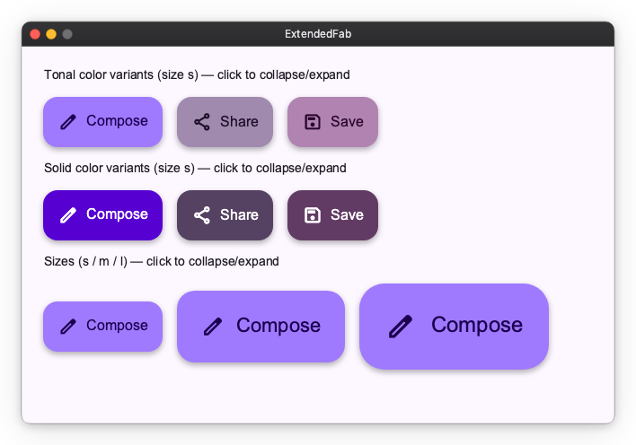
ExtendedFab
FAB with a label beside the icon. Toggle its expanded observable to morph between the extended pill and a circular FAB. Available in tonal and solid color variants across all three sizes.
FabMenu
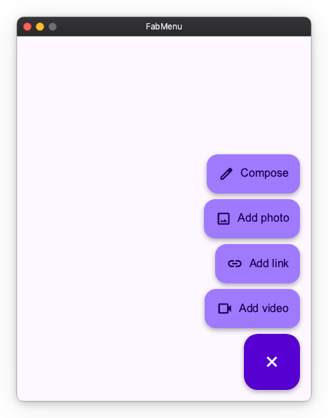
M3 Expressive FAB menu. A single is_open observable morphs the FAB between its add and close icons and reveals a stack of labelled FabMenuItem actions, dismissed by tapping outside or selecting an action.
API References: FabMenu ・ FabMenuItem
SplitButton
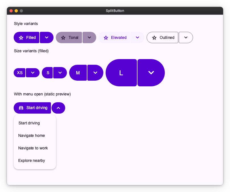
M3 Expressive split button — a leading action button joined to a trailing button that opens a menu. Available in Filled, Tonal, Elevated, and Outlined styles across sizes XS–L.
ButtonGroup
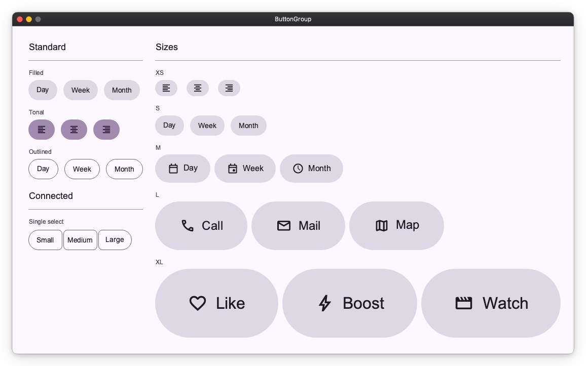
Group related actions. StandardButtonGroup keeps spacing between buttons; ConnectedButtonGroup connects them as a single segmented control.
Selection Controls
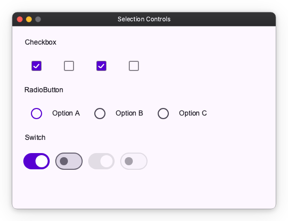
Checkbox, RadioButton (typically grouped via RadioGroup), and Switch for boolean / single-select input.
API References: Checkbox ・ RadioButton ・ Switch
Slider
Numeric input, split by axis. HorizontalSlider / VerticalSlider select a value in a range, the *CenteredSlider variants are anchored at zero, and the *RangeSlider variants select a min/max pair. Horizontal variants are sized with width; vertical variants with height.
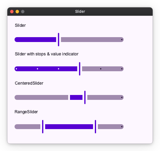
API References: HorizontalSlider ・ VerticalSlider ・ HorizontalCenteredSlider ・ VerticalCenteredSlider ・ HorizontalRangeSlider ・ VerticalRangeSlider
TextField
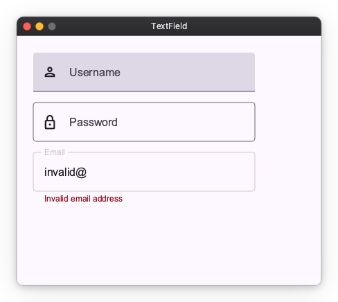
Text input. Available as FilledTextField and OutlinedTextField, with leading icons, supporting text, and error states.
Card
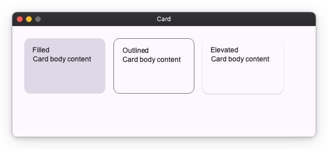
Container for grouped content. Three variants — Filled, Outlined, Elevated.
Chip
Compact actions and choices: AssistChip, FilterChip, InputChip, SuggestionChip.
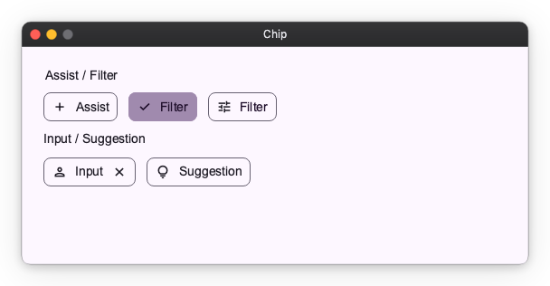
API References: AssistChip ・ FilterChip ・ InputChip ・ SuggestionChip
Badge
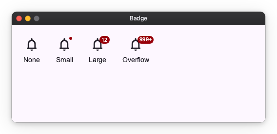
Small status indicator that decorates other widgets via a modifier. SmallBadge is a dot; LargeBadge shows a count.
API References: SmallBadge ・ LargeBadge
Divider
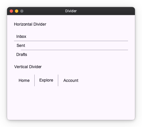
Separator line, split by axis. HorizontalDivider draws a full-width line (sized with width); VerticalDivider draws a full-height line (sized with height). The cross-axis thickness comes from the style.
API References: HorizontalDivider ・ VerticalDivider
Progress Indicators
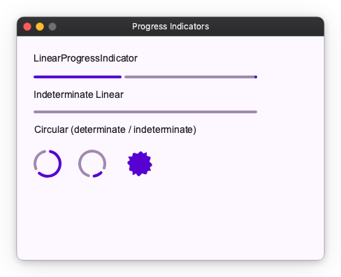
Linear and circular progress, in determinate and indeterminate variants. LoadingIndicator is the M3 Expressive shape-morphing indicator.
API References: LinearProgressIndicator ・ CircularProgressIndicator ・ LoadingIndicator
NavigationRail
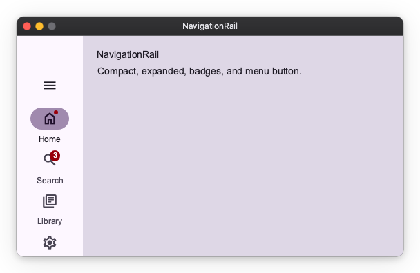
Vertical navigation bar with collapsed / expanded states, badges, and an optional menu button. Pairs with Material Navigator for routing.
Toolbar
Action bar of icon buttons. DockedToolbar stretches to its container; HorizontalFloatingToolbar / VerticalFloatingToolbar are pill-shaped overlays laid out along their respective axis.
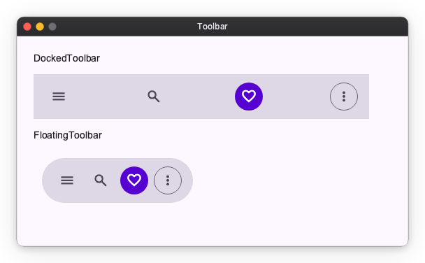
API References: DockedToolbar ・ HorizontalFloatingToolbar ・ VerticalFloatingToolbar
Menu
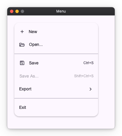
Vertical list of MenuItems. Supports leading icons, trailing shortcut/affordance text, dividers, and disabled items.
Tooltip
Contextual hint shown next to a target. Tooltip is a plain text label; RichTooltip supports a title, body, and action buttons.
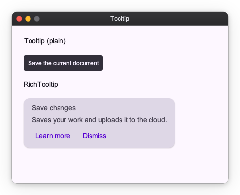
API References: Tooltip ・ RichTooltip
StandardSideSheet
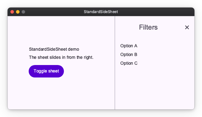
Docked side panel that sits beside the main content area. Unlike the modal SideSheet, it is a permanent part of the layout. Wrap it in Collapsible (with axis="horizontal") to animate it open and closed without any additional API on the sheet itself.
Collapsible(
    StandardSideSheet(
        panel_content,
        headline="Filters",
        on_close=vm.close_panel,
    ),
    opened=vm.panel_open,
    axis="horizontal",
    alignment="top_right",
)
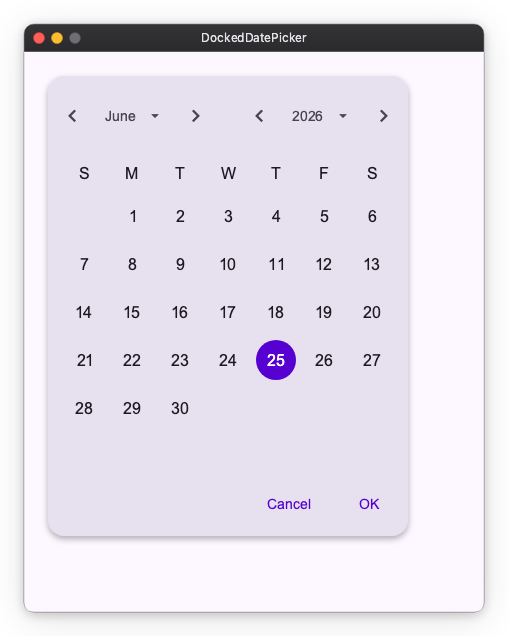
DockedDatePicker
Inline calendar that always stays visible (not a dialog). It writes the selected datetime.date back to a shared observable and supports min_date / max_date bounds.
Image
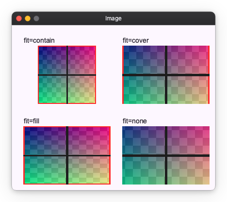
Image is a primitive widget that is not part of Material Design. Displays a raster image from in-memory bytes. Supports contain, cover, fill, and none fit modes.